In my 6 years as Vice President of User Experience Design & Research, and then later as Vice President of Consumer Strategy, I led hundreds of projects on the Edmunds wired and mobile website. One of our consistent areas of focus and optimization is the Home Page.
Edmunds 2009: Before I joined
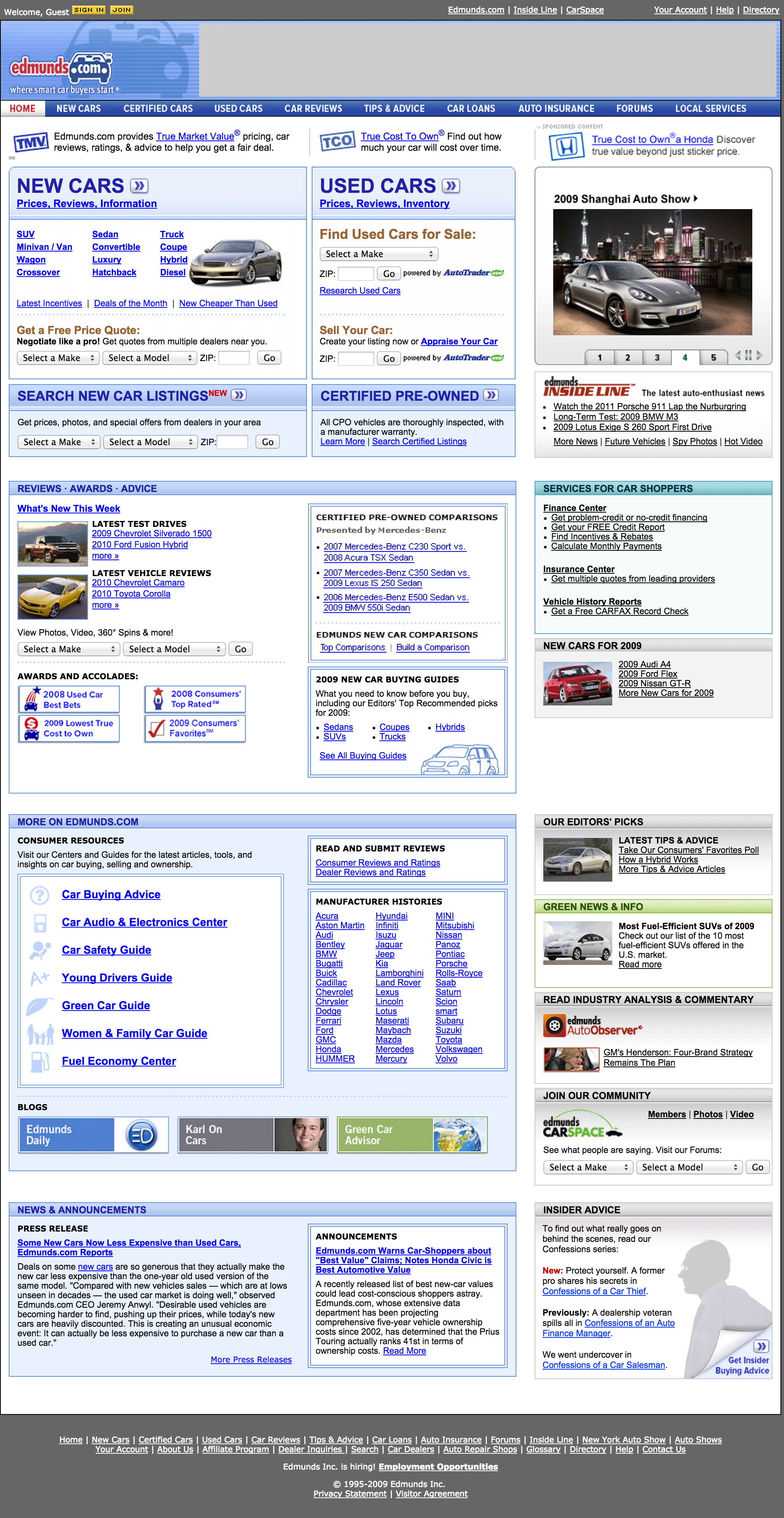
When I joined in 2009, Edmunds was beloved by millions of shoppers for its comprehensive data and informative content. However, the site suffered from significant design and usability problems. There were no brand guidelines driving the design of the site: we had no style guide and were using over 25 different variations of the logo throughout the site!
Although shoppers loved the rich editorial content, the busy design made it difficult for them to focus in on what they were looking for. My job was to improve the design, user experience and performance of the Edmunds.com website.
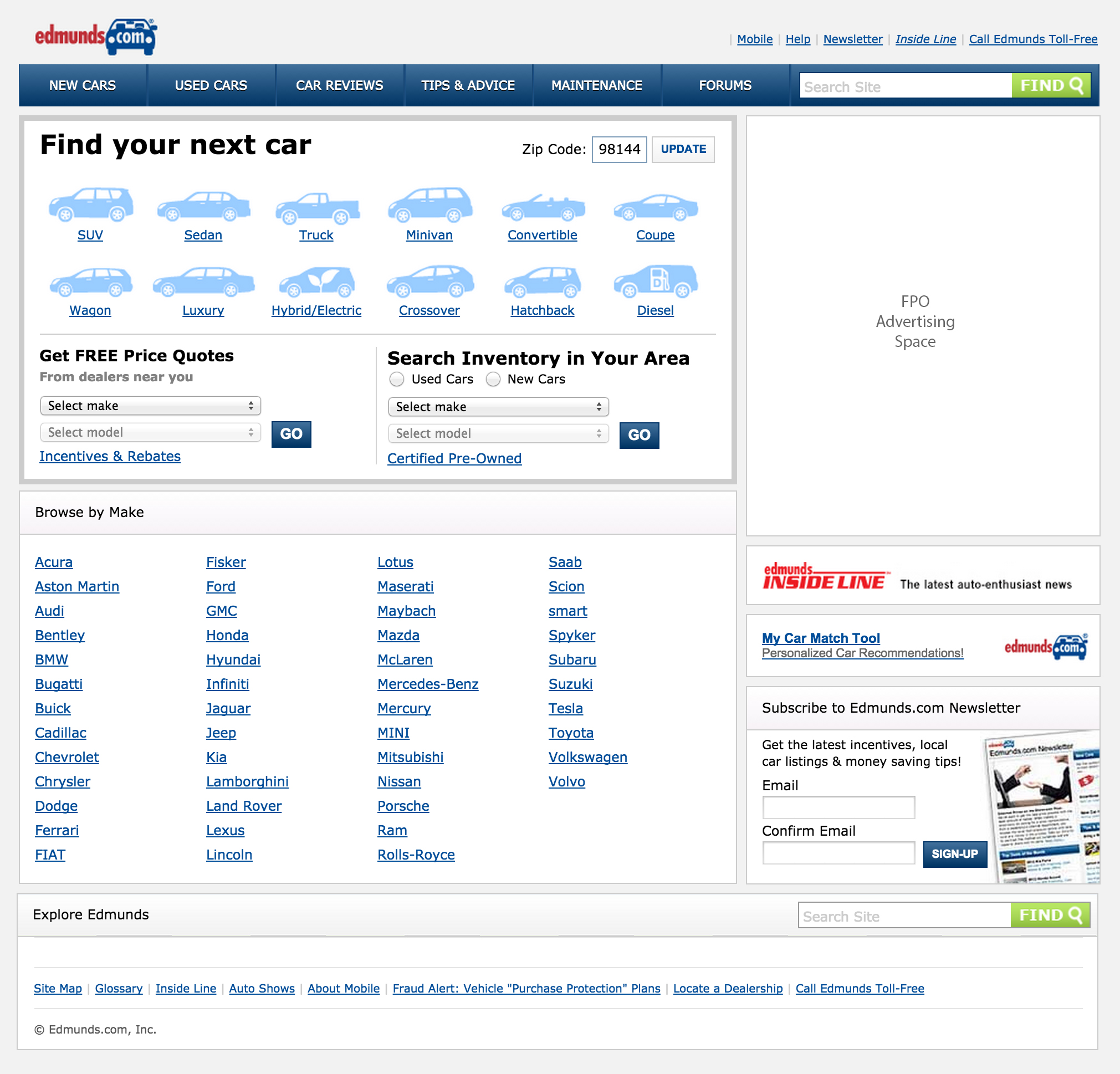
Edmunds 2011
In this design, we asked ourselves, “Could we create a simplified experience that featured only 20% of the content of the previous site but addressed the needs of 80% of our shoppers?” Testing and analytics told us that the vast majority of users started their journey by choosing either a type or a brand of car, so we focused there.
A refined color palette and consistent, intuitive iconography helped the site feel easy to use. Shoppers loved the simplified interface.
This streamlined approach also opened up the site to more advertising opportunities, which super-charged the growth of the company. Although this design shows only one advertising space, the site was built in a dynamic way which allowed us to sell advertising space between the content pods, thus dramatically increasing the available ad footprint.
 Edmunds 2015
We continued to experiment with design and layout, striving to find new ways to optimize customer experience, advertising performance and lead submissions. This home page design is the result of extensive customer research and A/B testing.
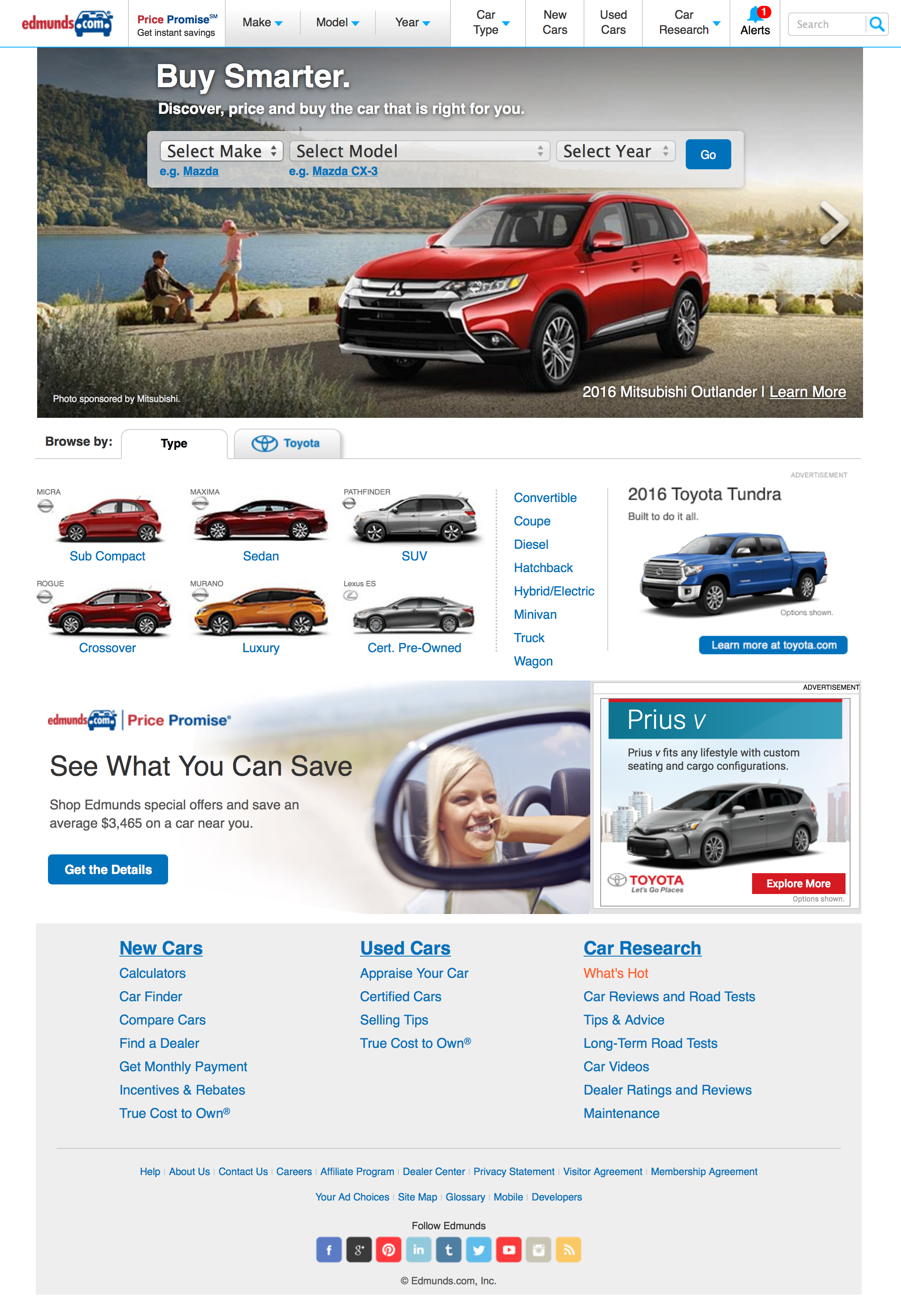 The top navigation and central drop-down menus maintain focus on shoppers’ most popular task – browsing for a car by Make and Model – while making it easy to access research content.
In this design, we explored ways of integrating advertising opportunities into the content of the website, rather than creating islands of advertising. The “hero shot” is an ad, as are all the photos in the widget that allows shoppers to browse by type.
This approach to advertising design was a win for everyone. Shoppers prefer this integrated design because it doesn’t distract them from their task at hand, advertisers enjoy much higher click-through-rates and Edmunds doesn’t have choose between devoting valuable real estate to content or ads.
