As Vice President of User Experience Design & Research, I led a complete redesign of the LiveNation.com website, resulting in enormous gains in conversion, revenue, SEO and customer satisfaction.
2007: before i joined
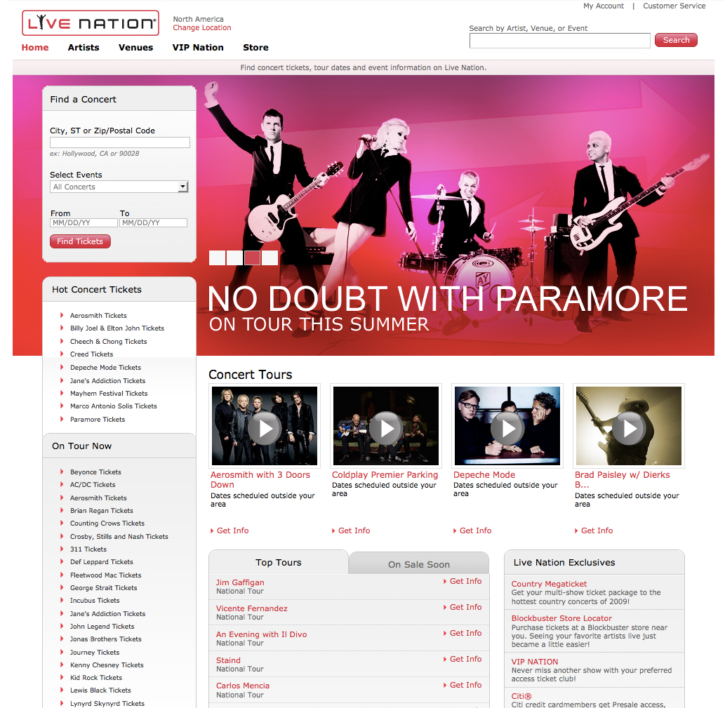
Before I joined in 2007, the original Live Nation home page had significant problems. Although LiveNation.com sold tickets to some of the hottest concerts in town, the website didn’t clearly communicate this through its design and user experience.

2008 Redesign
As head of design, user experience, research, content, SEO and SEM, my first order of business was to evolve the product and design to bring it on-brand, make it easy to use, and drive revenue.
We needed to ensure that fans were able to quickly find the show they were interested in, and easily buy tickets. On the Home Page, we featured popular artists in a carousel, and created an alphabetical index of all shows currently on sale. In this full-site redesign, we also streamlined the purchase funnel and shopping cart experience.
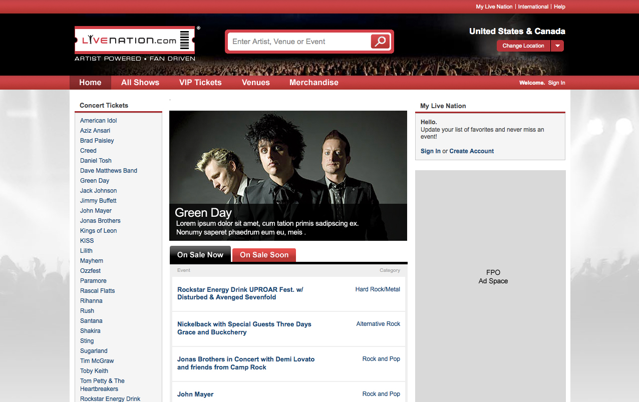
2009 Redesign
The 2nd website redesign had three goals:
- Emphasize the live concert experience
- Position Live Nation as the premier online destination for buying tickets
- Create a user experience that was intuitive and familiar
On the Home Page we simplified the user experience by moving the search box into the header and pulling more of the alphabetical index of artists above the fold. This new design and architecture was carried throughout the website. Again, we saw significant jumps in both usability and conversion.
Jacqueline Remus
