What do these things have in common?

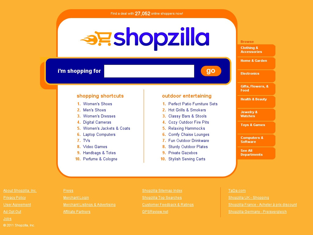
The Shopzilla website often reminded me of a Lamborghini. Besides sharing a preference for the color orange, they were both built for performance and speed. People either loved or hated the design, but no one could deny the performance.
One of the most important things I learned as head of product design and user experience research for Shopzilla was how to design to improve performance for both the business and for shoppers.
At a time when most other dotcoms were worrying about how to stay afloat, at Shopzilla we were focused on optimizing website design through sophisticated A/B and multivariate testing. Through thousands of design tests, I learned that even subtle design changes can have major impacts on both the user experience and the bottom line.
It’s easy to see the design differences between these two home pages, but could you guess which one performs the best, in terms both customer satisfaction and conversion? It’s probably not what you think!

Want to learn more about how the design of the Shopzilla website helped grow the company from a tiny startup to a $525 million dollar company? Interested in having me help optimize the design of your website? Contact me and I’ll be happy to help.


